
Work
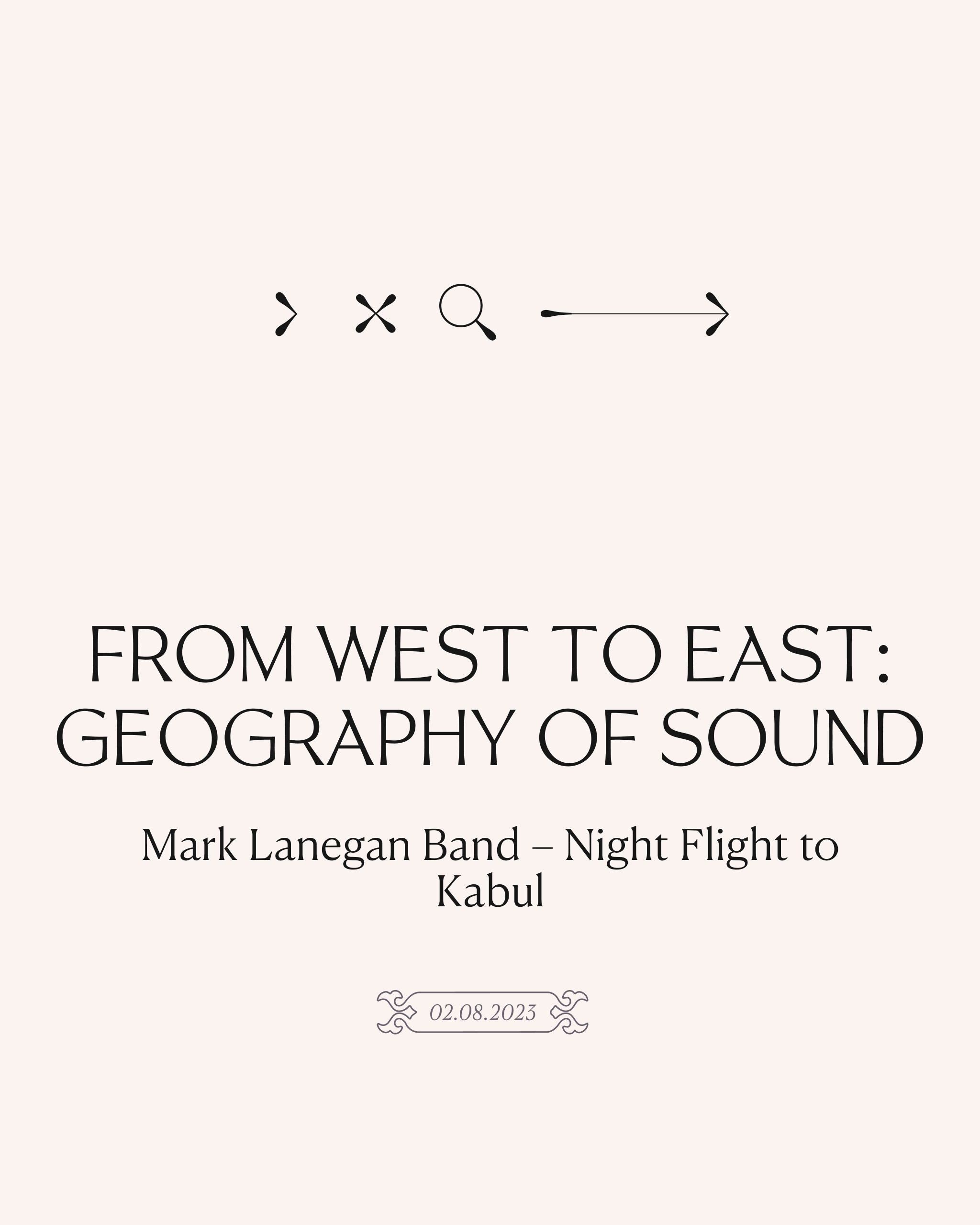
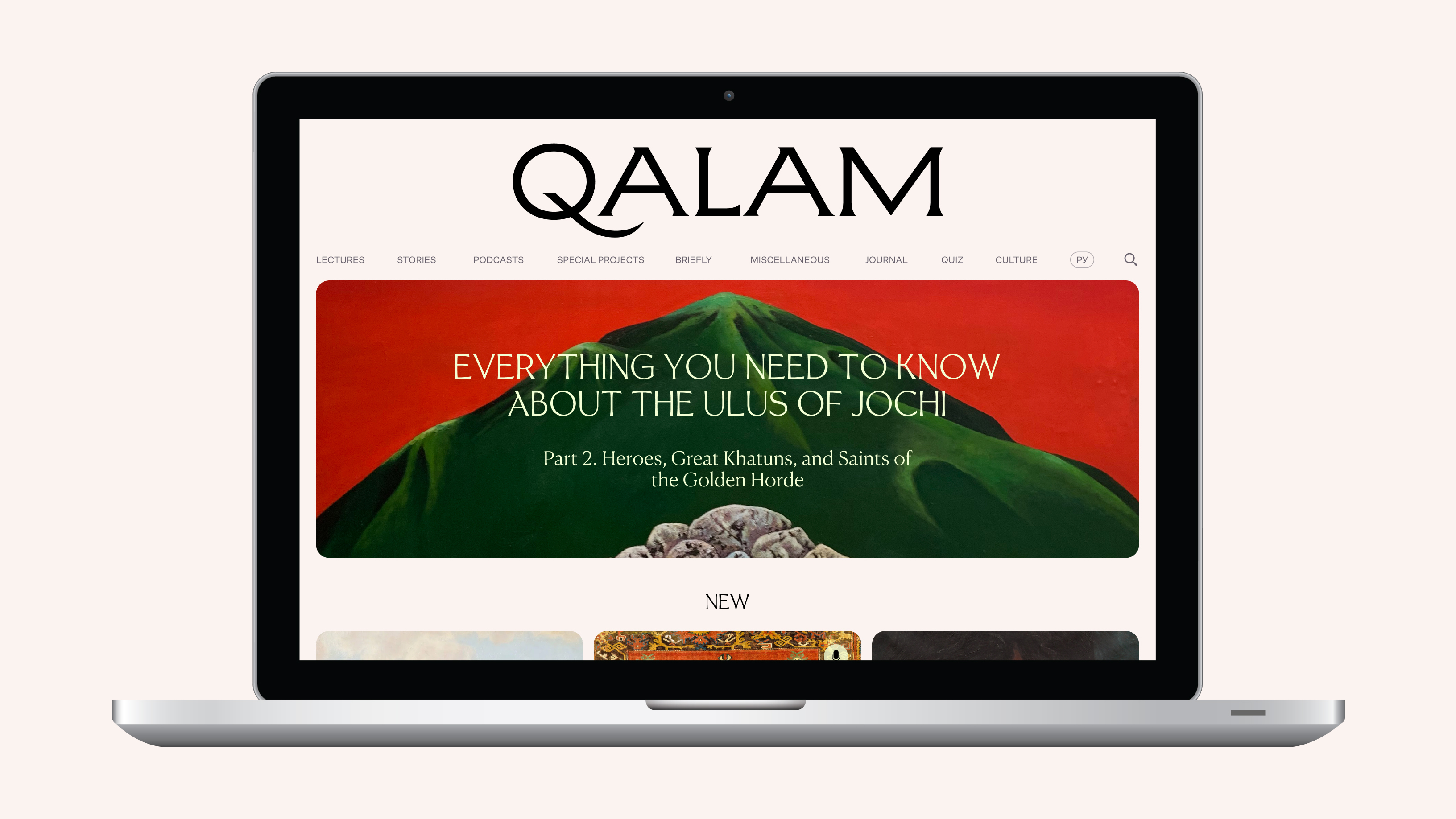
Qalam is a new media magazine dedicated to the history and culture of the world as seen from the heart of Asia
About
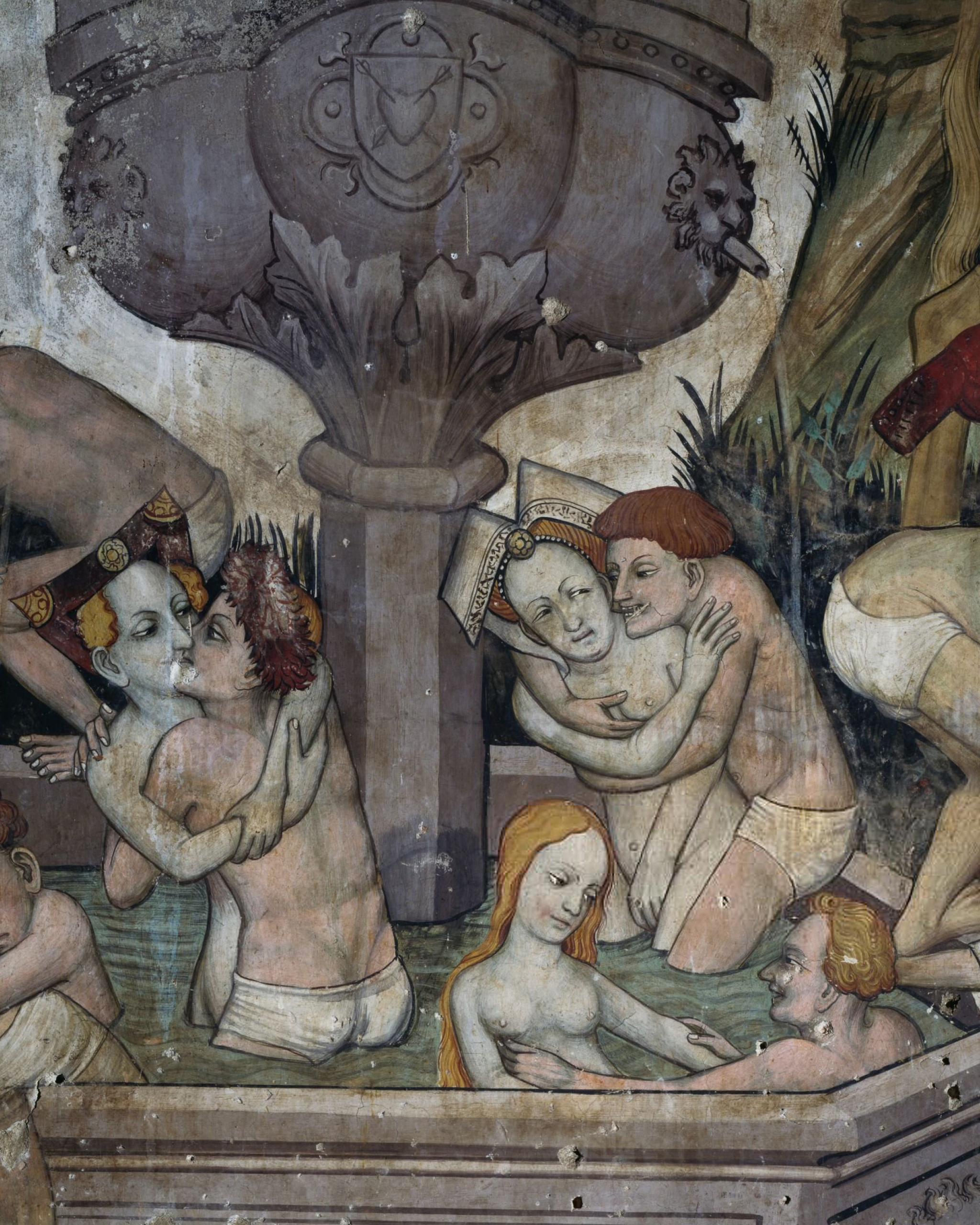
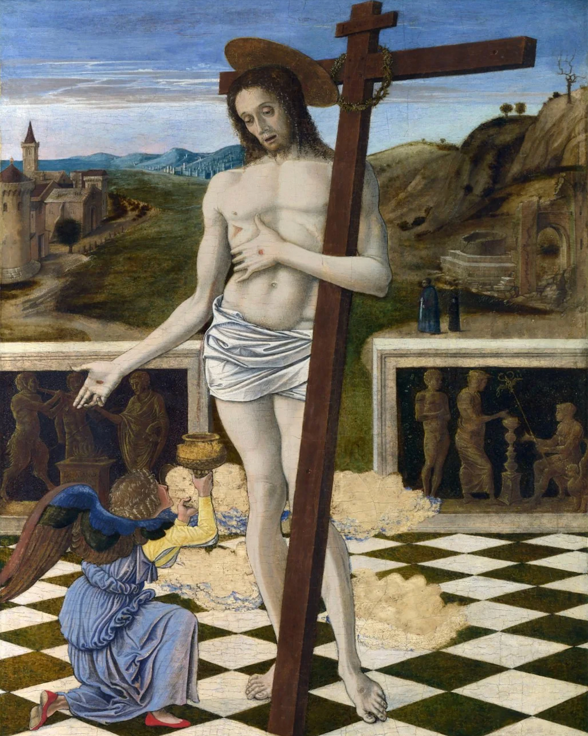
Over the centuries, Central Asia has been a place where ideologies, religions, and cultures have interacted, leaving a significant mark on the fate of this land and its unique diversity. As a link between East and West, North and South, and a meeting place for peoples, ideas, and goods, Central Asia has influenced neighboring regions and cultures.
Approach
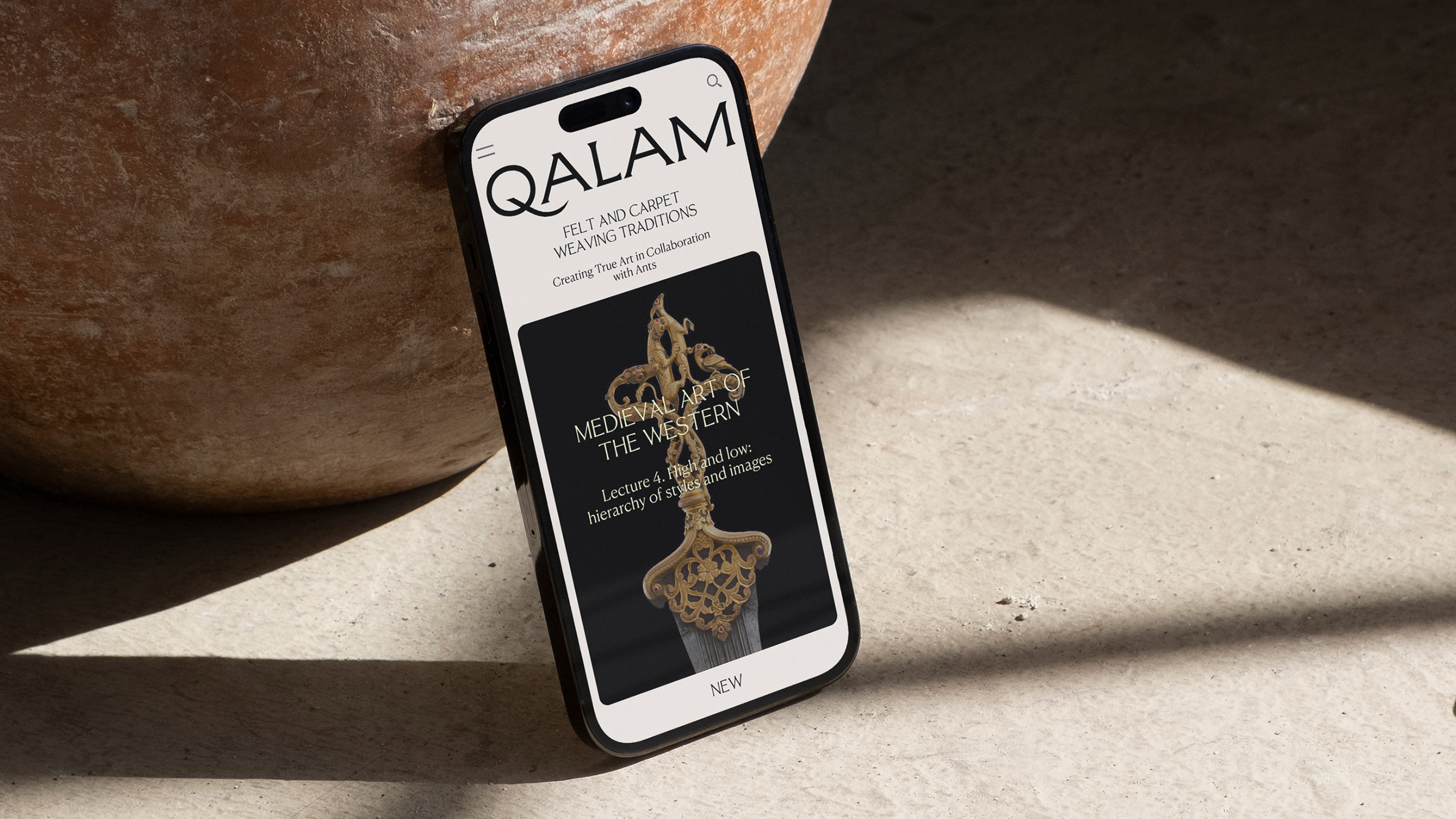
Drawing on oriental calligraphy and handwriting, we developed the concept, identity and digital design for the project, charged with medieval charm and heritage. The plasticity of the logo font reflects handwriting, featuring a dynamic stroke of the letter Q that inherits the character of a calligraphic tool stroke. Qalam is a sharply honed reed used for calligraphy, in ancient times it was used for writing on birch bark or palm leaves. The graphic system is inspired by architectural elements and the stroke shape formed by the writing tool in the Early Middle Ages.
Design Team
Design director— Ira Kosheleva
General produсer — Konstantin Tolstikov
Art director — Anna Tolchinskaya
Lead designer — Marina Gaiman
Type designer — Liza Rasskazova
Designer — Julia Selezneva
Project manager — Daria Abramova
Fonts
Letterhead Studio
Type.today
Contrast Foundry
Client
Qalam
Next project
Bonkind
Work
About
Contact
Mist NYC
Digital Design
Qalam
Qalam is a new media magazine dedicated to the history and culture of the world as seen from the heart of Asia
About
Over the centuries, Central Asia has been a place where ideologies, religions, and cultures have interacted, leaving a significant mark on the fate of this land and its unique diversity. As a link between East and West, North and South, and a meeting place for peoples, ideas, and goods, Central Asia has influenced neighboring regions and cultures.
Approach
Drawing on oriental calligraphy and handwriting, we developed the concept, identity and digital design for the project, charged with medieval charm and heritage. The plasticity of the logo font reflects handwriting, featuring a dynamic stroke of the letter Q that inherits the character of a calligraphic tool stroke. Qalam is a sharply honed reed used for calligraphy, in ancient times it was used for writing on birch bark or palm leaves. The graphic system is inspired by architectural elements and the stroke shape formed by the writing tool in the Early Middle Ages.
Design Team
Design director— Ira Kosheleva
General produсer — Konstantin Tolstikov
Art director — Anna Tolchinskaya
Lead designer — Marina Gaiman
Type designer — Liza Rasskazova
Designer — Julia Selezneva
Project manager — Daria Abramova
Fonts
Letterhead Studio
Type.today
Contrast Foundry
Client
Qalam
Publication
Bonkind
Get in touch
Let’s talk about
your project

Work
About
Contact
Mist NYC
Digital Design
Qalam
Qalam is a new media magazine dedicated to the history and culture of the world as seen from the heart of Asia
About
Over the centuries, Central Asia has been a place where ideologies, religions, and cultures have interacted, leaving a significant mark on the fate of this land and its unique diversity. As a link between East and West, North and South, and a meeting place for peoples, ideas, and goods, Central Asia has influenced neighboring regions and cultures.
Approach
Drawing on oriental calligraphy and handwriting, we developed the concept, identity and digital design for the project, charged with medieval charm and heritage. The plasticity of the logo font reflects handwriting, featuring a dynamic stroke of the letter Q that inherits the character of a calligraphic tool stroke. Qalam is a sharply honed reed used for calligraphy, in ancient times it was used for writing on birch bark or palm leaves. The graphic system is inspired by architectural elements and the stroke shape formed by the writing tool in the Early Middle Ages.
Design Team
Design director— Ira Kosheleva
General produсer — Konstantin Tolstikov
Art director — Anna Tolchinskaya
Lead designer — Marina Gaiman
Type designer — Liza Rasskazova
Designer — Julia Selezneva
Project manager — Daria Abramova
Fonts
Letterhead Studio
Type.today
Contrast Foundry
Client
Qalam
Next project
Bonkind